 MADE IN USA



Why Lighting Changes Everything
The Same Print Can Look Different Without Changing at All
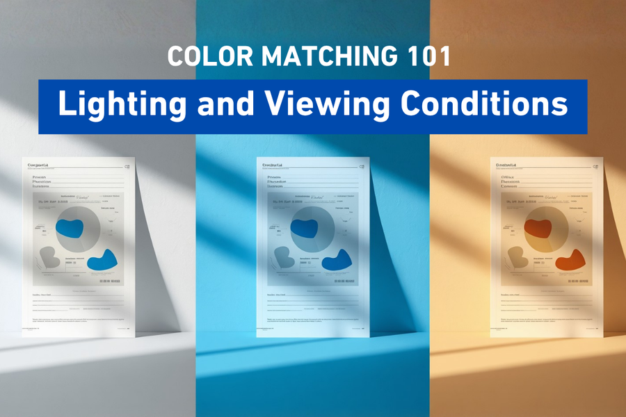
Have you ever looked at a freshly printed graphic in your shop and thought it looked perfect, only to carry it outside and notice the colors seemed different? Chances are, nothing about the print changed. The lighting did. Understanding how light affects color perception is one of the most overlooked yet important aspects of achieving consistent, reliable color.
Have You Ever Had a Print "Change" Color?
Have You Ever Had a Print "Change" Color?
A customer picks up a banner from your shop and tells you it looks fantastic.
Later that afternoon, they call and say the colors don't look the same once they installed it outside.
Did something happen to the ink?
Did the printer make a mistake?
Probably not.
More often than not, the only thing that changed was the lighting.
One of the most surprising lessons in color management is that color doesn't exist on its own. We only see color because light reflects off an object and reaches our eyes. Change the light, and the color can appear to change too.
Understanding this simple concept helps explain why evaluating color under consistent lighting is just as important as using the right printer, ink, and media.
Color Needs Light
Color Needs Light
Imagine walking into a completely dark room.
A bright red shirt, a blue sign, and a green poster all appear the same.
Black.
The colors haven't disappeared. There simply isn't any light available for your eyes to see them.
When light shines on a printed surface, part of that light is absorbed by the ink and part is reflected back to your eyes.
The reflected light determines the color you perceive.
Different light sources contain different combinations of wavelengths, so the same print may appear slightly different depending on where it is viewed.
Not All Light Is the Same
Not All Light Is the Same
Most people think of light as simply being "bright" or "dim."
In reality, light sources have very different characteristics.
For example:
- Morning sunlight has a different appearance than late afternoon sunlight.
- LED lighting varies depending on the bulb.
- Fluorescent office lights often produce a cooler appearance.
- Incandescent bulbs create a warmer, more yellow light.
- Retail lighting is often designed to make products appear more vibrant.
Each of these lighting conditions can influence how printed colors are perceived.
That's why a print that looks perfect in your production area may appear different in a customer's office, store, or home.
Brightness Isn't the Only Factor
Brightness Isn't the Only Factor
It's easy to assume that brighter light automatically produces better color evaluation.
That's not necessarily true.
Extremely bright lighting can hide subtle color differences.
Very dim lighting can make colors appear muted.
Even glare from glossy media can affect what we see.
Professional viewing environments are designed to balance brightness, color temperature, and reflection so colors can be evaluated more accurately.
Color Temperature Explained
Color Temperature Explained
You may have noticed light bulbs labeled as "warm white," "cool white," or "daylight."
These descriptions refer to color temperature.
Color temperature describes the overall appearance of a light source.
For example:
- Warm lighting often has a yellow or orange appearance.
- Neutral lighting appears more balanced.
- Daylight lighting contains more blue wavelengths and often appears cooler.
Because different light sources emphasize different parts of the visible spectrum, they can change the appearance of printed colors.
Understanding this helps explain why matching colors under one type of lighting doesn't always guarantee they will look identical somewhere else.
What Is Metamerism?
What Is Metamerism?
Here's an interesting phenomenon.
Two printed colors may appear identical under one light source but noticeably different under another.
This effect is called metamerism.
It happens because different inks or materials may reflect light differently even when they appear to match under certain conditions.
For industries where precise brand colors are critical, evaluating prints under standardized lighting helps reduce surprises caused by metamerism.
Why Viewing Conditions Matter During Customer Approvals
Why Viewing Conditions Matter During Customer Approvals
Imagine showing a customer a proof inside your showroom.
They approve it immediately.
Later, they install the graphic in a brightly lit retail space and notice the colors appear slightly different.
Neither the proof nor the final print is necessarily wrong.
The viewing environments are simply different.
Whenever possible, it's helpful to consider where the finished product will actually be displayed.
A sign intended for outdoor use may be evaluated differently than artwork designed for an office lobby.
Understanding the final viewing environment helps set realistic expectations.
Clean Viewing Areas Improve Accuracy
Clean Viewing Areas Improve Accuracy
Lighting isn't the only thing that affects color perception.
The surrounding environment matters too.
Brightly colored walls, clothing, furniture, or nearby graphics can influence how our eyes perceive color.
Many professional color evaluation areas use neutral gray surroundings because gray has minimal influence on color perception.
Reducing visual distractions helps operators focus on the printed sample itself.
Lighting Is Part of the Color Workflow
Lighting Is Part of the Color Workflow
By now you've probably noticed a pattern throughout this series.
Color management isn't controlled by one single factor.
It's a combination of many variables working together.
So far we've discussed:
- RGB and CMYK
- ICC profiles
- Delta E
- Spectrophotometers
- White ink stability
- Print media
Lighting is another important piece of that puzzle.
Ignoring it can make even well-managed workflows appear inconsistent.
Practical Tips for Better Color Evaluation
Practical Tips for Better Color Evaluation
You don't need a laboratory to improve color evaluation.
Simple habits can make a noticeable difference:
- Evaluate important prints under consistent lighting.
- Avoid comparing colors in dramatically different environments.
- Keep viewing areas clean and free from distracting colors.
- Consider where the final print will be displayed.
- When possible, compare prints under the same lighting conditions each time.
These small improvements help create more reliable color decisions.
Why Understanding Lighting Matters
Why Understanding Lighting Matters
Every print is ultimately viewed under some type of lighting.
Whether it's a billboard in bright sunlight, a menu under restaurant lighting, or a promotional display in a retail store, the environment influences how customers experience color.
Understanding that relationship helps printers produce work that performs well in real-world conditions rather than just inside the production area.
At STS Inks, we believe successful color management extends beyond the printer itself. Reliable color comes from understanding how equipment, materials, lighting, and workflow all work together. That's why we believe Color is in Our DNA.
Conclusion
Conclusion
Lighting is one of the most powerful influences on how we perceive color.
Even when the printed image doesn't change, different lighting conditions can dramatically alter its appearance.
By evaluating prints under consistent viewing conditions and understanding how lighting affects color, printers can make more confident decisions, improve communication with customers, and build workflows that produce dependable, repeatable results.
Key Takeaways
Key Takeaways
- Color cannot be seen without light, making lighting an essential part of color perception.
- Different light sources can change the appearance of the same printed color.
- Professional print shops often use standardized viewing conditions for consistent color evaluation.
- Metamerism explains why two matching colors may appear different under different lighting.
- Consistent viewing environments improve color decisions and customer satisfaction.
Frequently Asked Questions
Why does my print look different outside than it does inside?
Different lighting conditions contain different wavelengths of light, which change how colors are reflected and perceived.
What is color temperature?
Color temperature describes the appearance of a light source, ranging from warm (yellowish) to cool (bluish) light.
What is metamerism?
Metamerism occurs when two colors appear to match under one light source but look different under another.
Why do professional print shops use special viewing lights?
Standardized lighting helps ensure everyone evaluates color under the same conditions, reducing subjective differences.
Does room color affect how I see prints?
Yes. Brightly colored surroundings can influence color perception. Neutral gray environments help minimize this effect.
Should I evaluate every print under the same lighting?
Whenever possible, yes. Consistent viewing conditions improve repeatability and reduce confusion during color evaluations.
Can lighting fix poor color management?
No. Proper lighting supports accurate evaluation, but it cannot correct issues related to printer calibration, media, ICC profiles, or workflow.
Quick Definitions
Viewing Conditions: The lighting and surrounding environment used to evaluate printed color.
Color Temperature: A description of the appearance of a light source, typically ranging from warm to cool.
Metamerism: A phenomenon where colors appear to match under one light source but differ under another.
Neutral Gray: A commonly used color for viewing environments because it minimizes its influence on color perception.
Reflected Light: The light that bounces off a printed surface and reaches our eyes, allowing us to see color.
Next Episode
Episode 9: Troubleshooting Color Shifts
Even with the right printer, media, ICC profiles, and lighting, unexpected color changes can still happen. In the next episode, we'll walk through the most common causes of color shifts, how to identify them, and the practical steps you can take to solve problems before they become costly reprints.